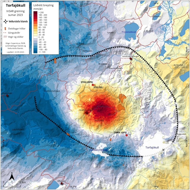
I thought it might be interesting for some of the #gischat members of Mastodon to share some of my everyday map making. A thread with a single map and some info on the data, techniques, tips, and tricks. Let's go!
Daily #mapmaking with #qgis
This map shows a recent #InSAR analysis for a volcanic caldera named Torfajökull. The InSAR signal shows there is surface inflation in the center of the volcanic caldera indicating sub-surface magma movement.
🧵 1/10
Daily #mapmaking with #qgis
This map shows a recent #InSAR analysis for a volcanic caldera named Torfajökull. The InSAR signal shows there is surface inflation in the center of the volcanic caldera indicating sub-surface magma movement.
🧵 1/10

Ragnar Heiðar Þrastarson
in reply to Ragnar Heiðar Þrastarson • • •The InSAR data is from Sentinel 1 processed by a very talented collogue at the Icelandic Met Office. We have not seen this before for this caldera, but we have not had access to InSAR for that long. This might be a recurring thing geologically. For this type of continuous data almost always opt to render it by multiplying it with a very faint hillshade.
Ragnar Heiðar Þrastarson
in reply to Ragnar Heiðar Þrastarson • • •I usually use discreet symbology/colors for datasets of this type. There are pros and cons for discreet vs. continuous. A choice of color is also very important. I avoid rainbows and try to pick colors that work for people with color vision deficiency. Note that #qgis can simulate these deficiencies. Check out Fabio Crameri’s article on the misuse of colour in science communication: https://www.nature.com/articles/s41467-020-19160-7
The misuse of colour in science communication - Nature Communications
NatureRagnar Heiðar Þrastarson
in reply to Ragnar Heiðar Þrastarson • • •Who is this map for? This is the first thing you should ask yourself when making a map. This map is for scientist of the Icelandic Met Office and our collaborators who all have a background in geology, geophysics, seismology, and volcanology. It also serves as a reference map for our monitoring team who might not be familiar with the area. Therefor I can leave out some legend items like the caldera rim because all my readers know it’s a caldera rim.
Ragnar Heiðar Þrastarson
in reply to Ragnar Heiðar Þrastarson • • •This map is in Icelandic. I constantly switch between Icelandic and English and most of the time I make both versions. Splitting layers into themes is great for this purpose. Another neat thing about #qgis is the option to apply expressions or even functions to most of the settings. For the coordinate tick-marks on the map boarder I have a very short expression that changes “19.2°W” to “19.2°V” since west in Icelandic is vestur (papercut, I know).
Ragnar Heiðar Þrastarson
in reply to Ragnar Heiðar Þrastarson • • •I use masks around my labels a lot. In #qgis you can also have buffers or halos around the text. But with masks you can control what elements of the map are affected by the mask. For example, the names of the lakes will only split the outline of the lake. This is one of those small things in mapmaking that make the map more readable without being noticed at first.