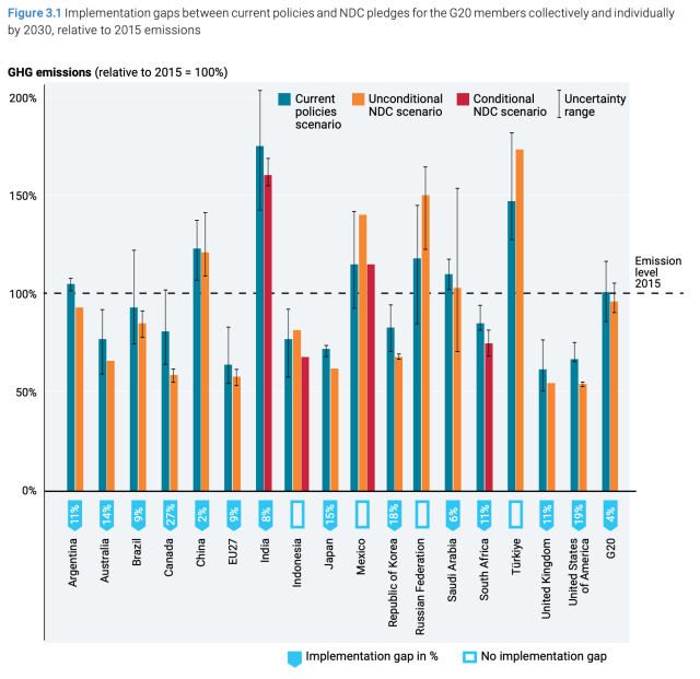
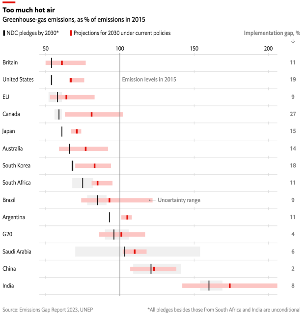
Believe it or not, these two charts are showing the same data. The grouped bars chart is from a UN climate report, and the interval bars version is from #TheEconomist. Amazing how much easier the latter is to read with just a few different design choices. #dataviz https://www.economist.com/graphic-detail/2023/11/20/the-world-is-still-failing-to-come-close-to-its-climate-goals
The world is (still) failing to come close to its climate goals
Progress has been made. But not nearly enoughThe Economist

