#DataVisualisation can be way cooler than standard charts and graphs.
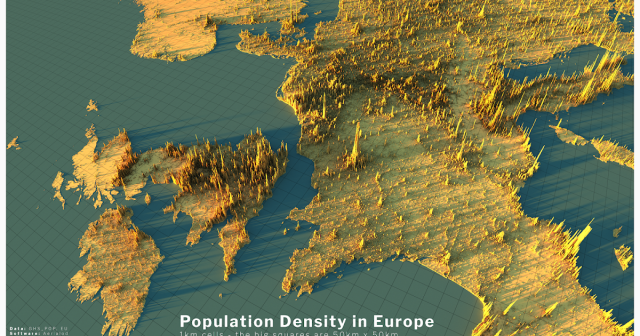
Alasdair Rae looks at population density in Europe -
http://www.statsmapsnpix.com/2020/04/population-density-in-europe.html
Raluca Nicola shows us earthquakes in a new light -
https://glowy-earthquakes.glitch.me/
Alasdair Rae looks at population density in Europe -
http://www.statsmapsnpix.com/2020/04/population-density-in-europe.html
Raluca Nicola shows us earthquakes in a new light -
https://glowy-earthquakes.glitch.me/

Population density in Europe
Population density is a subject I've been writing about for a while , so I decided to create a few more renders of European population dens...www.statsmapsnpix.com