Search
Items tagged with: datavisualisation
My first Nightingale blog post, talking about the start and evolution of our annual #dataviz challenge #30DayChartChallenge during April 🎉
https://nightingaledvs.com/the-30daychartchallenge-year-three/
30 days, 30 charts, 5 categories 📈
The 3rd edition starts in 4⃣ days!
#datavisualisation #datavis #datavisualization
https://nightingaledvs.com/the-30daychartchallenge-year-three/
30 days, 30 charts, 5 categories 📈
The 3rd edition starts in 4⃣ days!
#datavisualisation #datavis #datavisualization

The #30DayChartChallenge Is Ready to Kick Off - Nightingale
The #30DayChartChallenge is a data visualization community challenge to create a visualization on a particular theme each day in April.Cédric Scherer (Nightingale)
#DataVisualisation can be way cooler than standard charts and graphs.
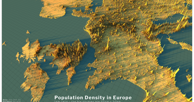
Alasdair Rae looks at population density in Europe -
http://www.statsmapsnpix.com/2020/04/population-density-in-europe.html
Raluca Nicola shows us earthquakes in a new light -
https://glowy-earthquakes.glitch.me/
Alasdair Rae looks at population density in Europe -
http://www.statsmapsnpix.com/2020/04/population-density-in-europe.html
Raluca Nicola shows us earthquakes in a new light -
https://glowy-earthquakes.glitch.me/

Population density in Europe
Population density is a subject I've been writing about for a while , so I decided to create a few more renders of European population dens...www.statsmapsnpix.com
