Search
Items tagged with: dataviz
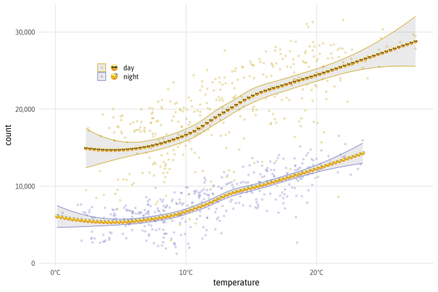
https://biketheft.gustav.uber.space/
#bike #Berlin #crime #dataviz

Grand Theft Berlin Bikes
Interactive visualizations of daily updating Bike Theft Data of Berlin.biketheft.gustav.uber.space
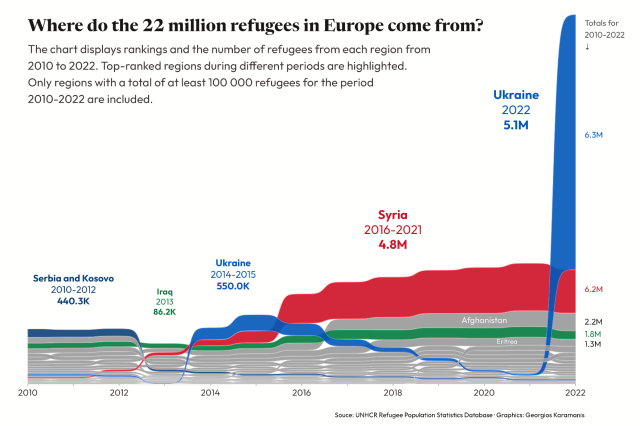
Code: https://github.com/gkaramanis/tidytuesday/tree/master/2023/2023-week_34
#RStats #dataviz
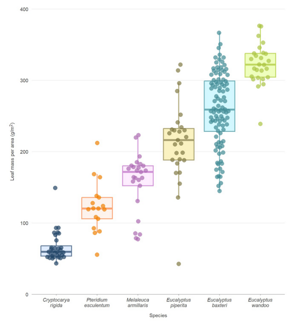
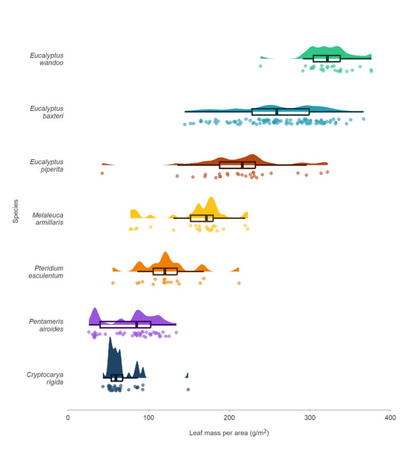
https://labs.ala.org.au/posts/2023-08-28_alternatives-to-box-plots/post.html
#rstats #dataviz #QuartoPub #AusTraits #ggplot2
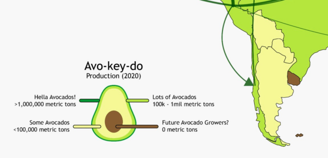
https://blog.datawrapper.de/color-keys-for-data-visualizations/. Avec une mention spéciale pour la légende avocat 🥑🥑 #DataViz
How to design a useful (and fun!) color key for your data visualization - Datawrapper Blog
Your chart or map needs a color key? Here's how to design one that readers will understand.Lisa Charlotte Muth (Datawrapper Blog)
I often think about who the "dataviz community" is. I often feel I miss 90% of it when I discover some dashboarding community, some book and author I've never even heard about. I think this book might open some new horizons.
#dataviz
https://www.frank.computer/blog/2023/08/art-of-insight-review.html

The Art of Insight, a picture of ourselves
Frank Elavsky’s review of Alberto Cairo’s forthcoming book, The Art of Insight.Frank Elavsky
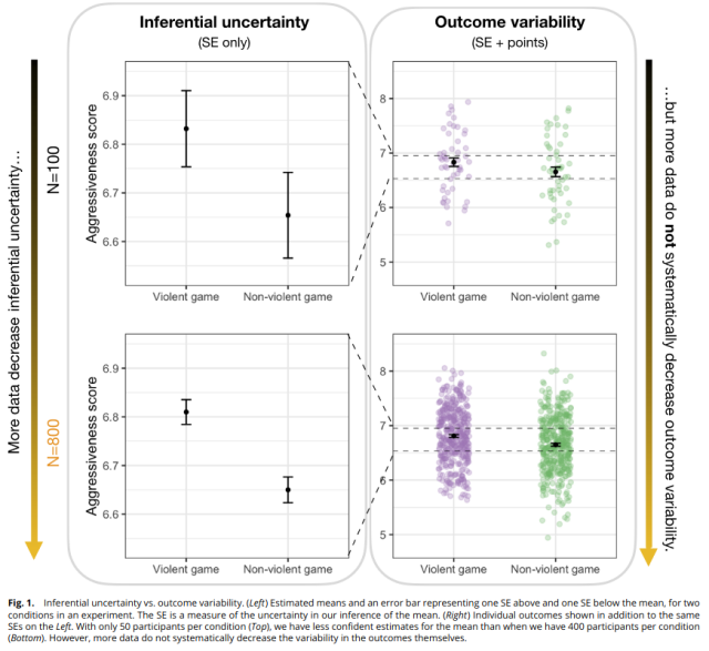
https://doi.org/10.1073/pnas.2302491120
Visualizing only inferential uncertainty can lead to significant overestimates of treatment effects, even among highly trained experts
Solution: when possible, plot individual data points alongside statistical estimates
#statistics #dataviz #statpubs
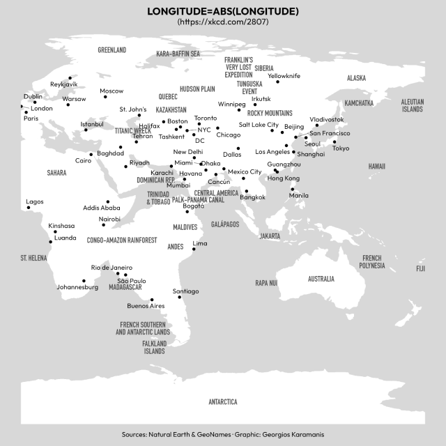
Code: https://github.com/gkaramanis/xkcd-map
#spatial #dataviz
GitHub - gkaramanis/xkcd-map
Contribute to gkaramanis/xkcd-map development by creating an account on GitHub.GitHub
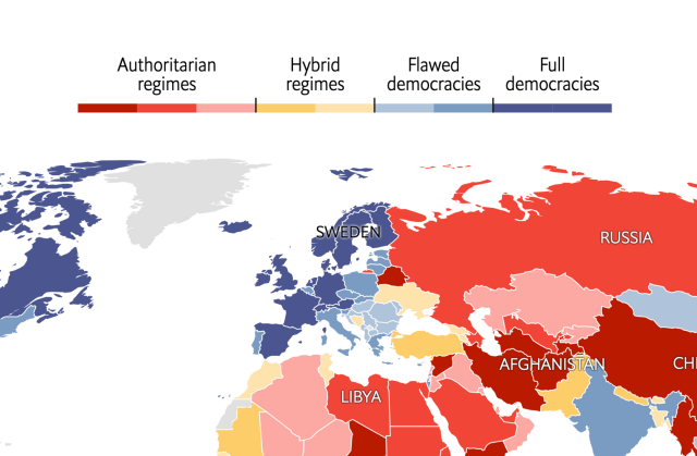
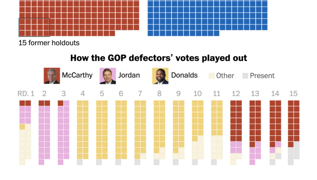
I'm especially interested in interactive color keys that show the distribution of the data – do you know any?
And yes, please show me all the great color keys you designed!
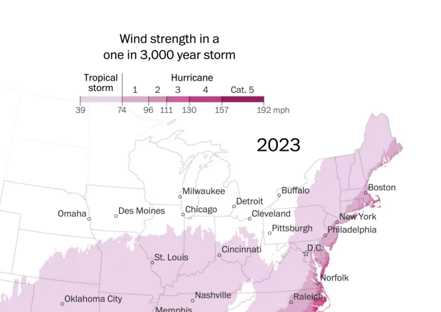
Sources for the color keys in the images:
👉 https://www.washingtonpost.com/climate-environment/interactive/2023/hurricane-risk-map-us-climate/
👉 https://www.washingtonpost.com/politics/interactive/2023/vote-results-house-speaker/
👉 https://www.economist.com/graphic-detail/2023/02/01/the-worlds-most-and-least-democratic-countries-in-2022
The world’s most, and least, democratic countries in 2022
The EIU’s global democracy index shows several authoritarian rulers tightened their gripThe Economist
on the extreme heat over the US, southern Europe and China, created using #QGIS Temporal Controller
https://bird.makeup/users/sdbernard/statuses/1682036951833272320
#GISChat #geospatial #heatwave #climatecrisis

